Prior to working at The Chronicle, I interned at The Seattle Times as a graphics intern and the San Francisco Public Press as a data journalism intern, creating graphics and helping co-report/research stories related to health and housing. While my first official data journalism stint (and brief foray into feature writing and copy editing) was with InfoNile, a geodata journalism initiative based in Kampala, Uganda, I did exploratory data analysis and research on child welfare-related data for the Investigative Reporting Program (UC Berkeley School of Journalism) and open source intelligence (OSINT) research on wildfire effects and health worker discrimination for the Human Rights Center (UC Berkeley School of Law). From 2022 through 2024, I volunteered and served as a volunteer lead at the Asian American Journalism Association Conference.
I graduated from UC Berkeley, where I majored in Public Health and minored in Journalism, Data Science and Global Poverty & Practice. My passions lie in art; disability justice; the prison-military industrial complex (and how academia plays a role in this); LGBTQIA+ identity and rights, AANHPI (Asian American Native Hawaiian Pacific Islander) justice; big tech, ethics and policy and the intersections of all of these topics.
Outside of work, you can find me listening to EDM, playing a racket sport and learning languages - I can speak some Spanish and Korean, and I’m currently learning Japanese, ASL (American Sign Language) and Mandarin (let's yap about language learning apps!).
Browse my work!
Press the tab and space keys or hover and click to select for all projects or for only writing, only interactives or only multimedia projects!
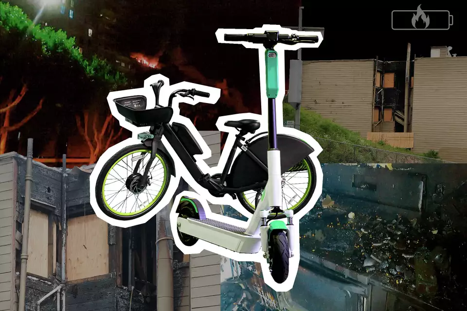
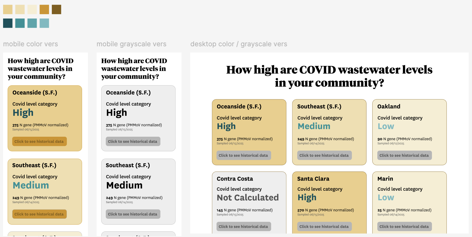
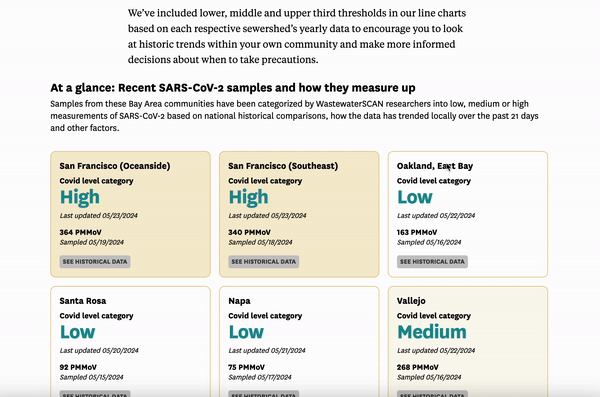
These charts track COVID in the Bay Area through wastewater data
What I did: I led both back-end development to pull wastewater data daily at 9 AM PST from WastewaterSCAN API and front-end development to display SARS-CoV-2 historic and most recent concentration levels at different Bay Area wastewater treatment plants. I also included long COVID resources and a map of sewershed boundaries for Bay Area readers to identify which sewershed serves them.
The Chronicle is using wastewater surveillance to track the prevalence of COVID-19 in the Bay Area. Due to the scaling back of virus tracking efforts nationwide, scientists and public health experts — including those at the U.S. Centers for Disease Control and Prevention — have turned to monitoring the concentration of SARS-CoV-2 particles found in wastewater at sewage treatment plants as a more dependable metric for community-level infection rates.
Behind the design of this story
First goal: Design a story that both gives nuanced context on why different health institutions are switching to monitoring COVID levels through wastewater surveillance and acts as an informative dashboard/tool allowing readers to easily find their local wastewater levels to give them a better picture (but not the full picture) on COVID prevalence in their communities.
Second goal: Highlight existing long COVID resources and research (tying this tool with more disability and disability-justice oriented work).
Approx. timeline: Low fidelity mockups + prototyping (February 2024), back-end (March - April 2024) & front-end development and reporting (May - July 2024)
Reflections and takeaways: This project was a delicate balance in making sure the health research I was reporting was accurate and included necessary caveats and nuance while still ideating and creating an easy-to-use tool for readers to gauge COVID prevalence, especially as in-home COVID tests became more common and other measurements of COVID prevalence became less accurate. I learned to ask early and often for clarification on all aspects of this project: checking with local epidemiologists on meanings of different measurements, partnering with WastewaterSCAN to use their API for this tool rather than collecting local wastewater data in a roundabout way with Python scraping script or sweating the small details of chart visualization design and finding more effective ways to display tooltips or tertiles.
Earlier Figma mockups of dashboard - grayscale version v.s.using color on the individual dashboard components could represent severity of COVID level categories assigned by WastewaterSCAN
How San Francisco’s Black population changed, block by block over 50 years
What I did: I designed and developed primarily the topper of this story highlighting the different hubs of Black culture and community in San Francisco in the last several decades.
This S.F. neighborhood now has the most Airbnbs — and it’s not the Mission
Languages/Programs used: Google Sheets (data cleaning and analysis), Datawrapper (data visualization)
What I did: I conducted the data collection, analysis, reporting and visualization for this story revisiting the Airbnb landscape in San Francisco. Looking at Inside Airbnb data, I described trends in neighborhoods with the largest shares of Airbnb listings, a continued gap between total and active listings and the largely policy-driven change from hosts managing short-term listings to more intermediate and long-term listings.
How one family fought for 100 years to free the Klamath river
For 100 years, this family fought to free the Klamath River. As a child, Amy Bowers Cordalis learned a legend from her Yurok ancestors. If the Klamath River salmon die, so will the Yurok people.
What I did: I assisted in the design direction of this video and photo-driven story, and added an illustrative motif of the Chinook salmon throughout the story as an homage to the culture this story highlights and honors.
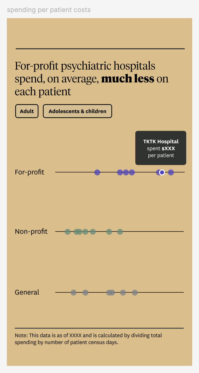
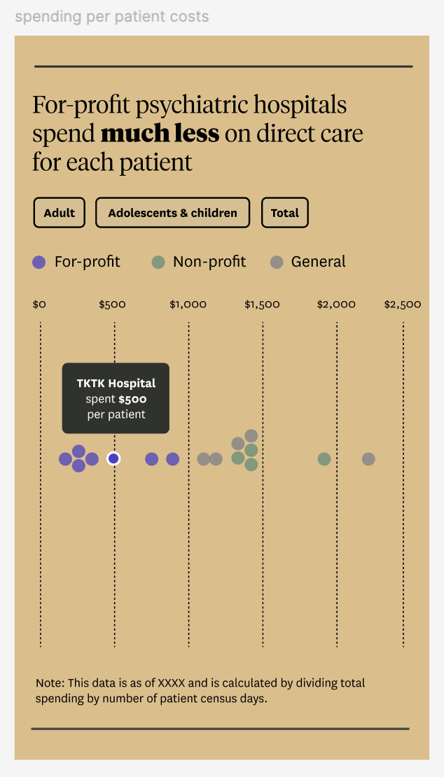
California is embracing psychiatric hospitals again. Behind locked doors, a profit-driven system is destroying lives
🏆 This investigative story was a 2026 Pulitzer Prize finalist in the Investigative Reporting category.
What I did: I designed and developed the graphics used in the second part of this investigation, including the chart comparing bed capacity growth among different types of institutions and the interactive graphic comparing per patient spending among forprofit, nonprofit and general acute psychiatric hospitals in California.
Behind the design of this story
First goal: Design a visualization that clearly shows that based on data from hundreds of hospitals, for-profit hospitals on average spend less on direct patient care than other types of hospitals.
Second goal: Design a tool that allows readers to easily explore patient spending data at different California hospitals by patient type (adult or child) and by hospital type (for-profit, non-profit, general).
Approx. timeline: Low fidelity mockups + prototyping (December 2024), development (January - February 2024)
Reflections and takeaways: I learned to not be afraid to find inspiration outside or inside our own newsroom and modify visualization designs that worked in other contexts (e.g. a beeswarm graphic visualizing college admission data) to work in this context (visualizing psychiatric hospital spending data and toggling by type of data). Not all designs or data visualizations have to be ideated from scratch or completely new/novel. Close collaboration with fellow designers and design directors/editors to make sure this visualization was accessible while adhering to the overall story style was also crucial.
Earlier version of interactive tool
Initial beeswarm mockup of interactive tool
🏆 How AI depicts San Francisco — and what it gets wrong
🏆 This story received an Award of Excellence at the 2025 SND Best of News Design Creative Competition. We asked four different generative AI models to depict today’s San Francisco, its residents and how the city would look in 2074.
What I did: I led the art and design direction and spearheaded the data collection and visual analysis of hundreds of different generative AI images of San Francisco and its residents. I contributed reporting alongside the now-retired urban critic John King and AI and tech reporter Chase DiFeliciantonio on reporting for this story.
Behind the design of this story
Goal: Design an interactive storytelling format that allows readers to easily see the most common motifs among hundreds of images in an engaging way without overwhelming readers or impacting page performance.
Approx. timeline: Data collection/image generation (Jul.-Sept. 2024), low fidelity mockups + prototyping (Oct. 2024), development (Nov. 2024)
Reflections and takeaways: Collaborating with reporters and editors familiar or unfamiliar with the different GenAI models and unfamiliar with prototyping tools like Figma was a rewarding challenge. Multiple efficient meetings early on were incredibly crucial to (1) go over story direction based on generated image data collection (2) ideate different ways to show all the different generated images (3) get feedback and refine sketches and mockups of both interactive graphics and full page design and (4) solicit feedback through in-person meetings and Slack huddles on different full page test links. Iterating over different versions of graphics frequently, getting feedback from users with varying mobile and desktop experiences and not being afraid to push back if certain ideas brought up by non-developers/non-designers weren’t feasible in the given timeline were also important learning lessons.
Interactive mockup for one of the grids of generated images for readers to see most common symbols/motifs of San Francisco (e.g. Golden Gate Bridge, Victorian houses, cable cars)
Initial mockup for story intro/topper (enabled by click rather than scroll)
Inspiration for "search input" motif in story came from seeing the search input in various GenAI models
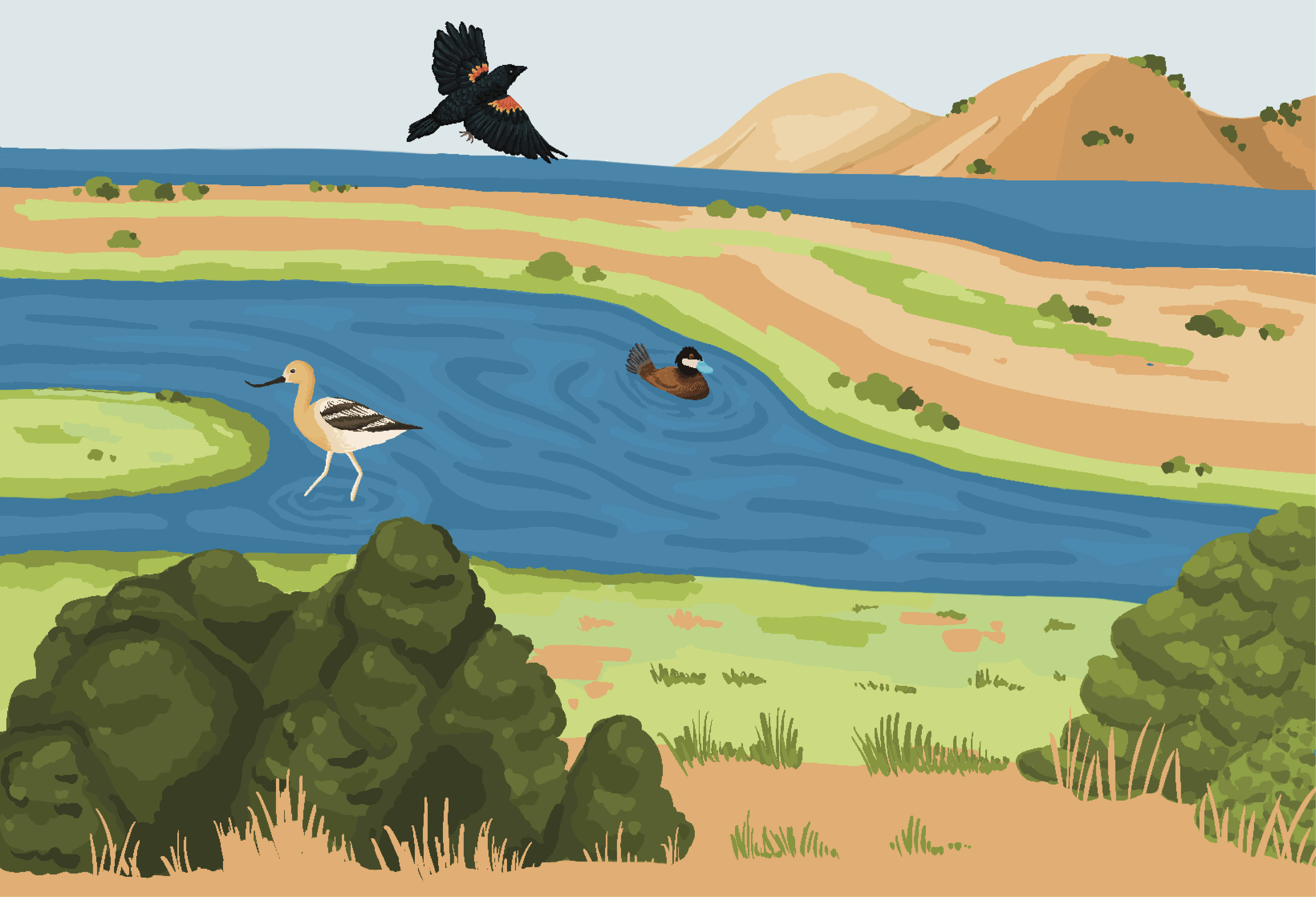
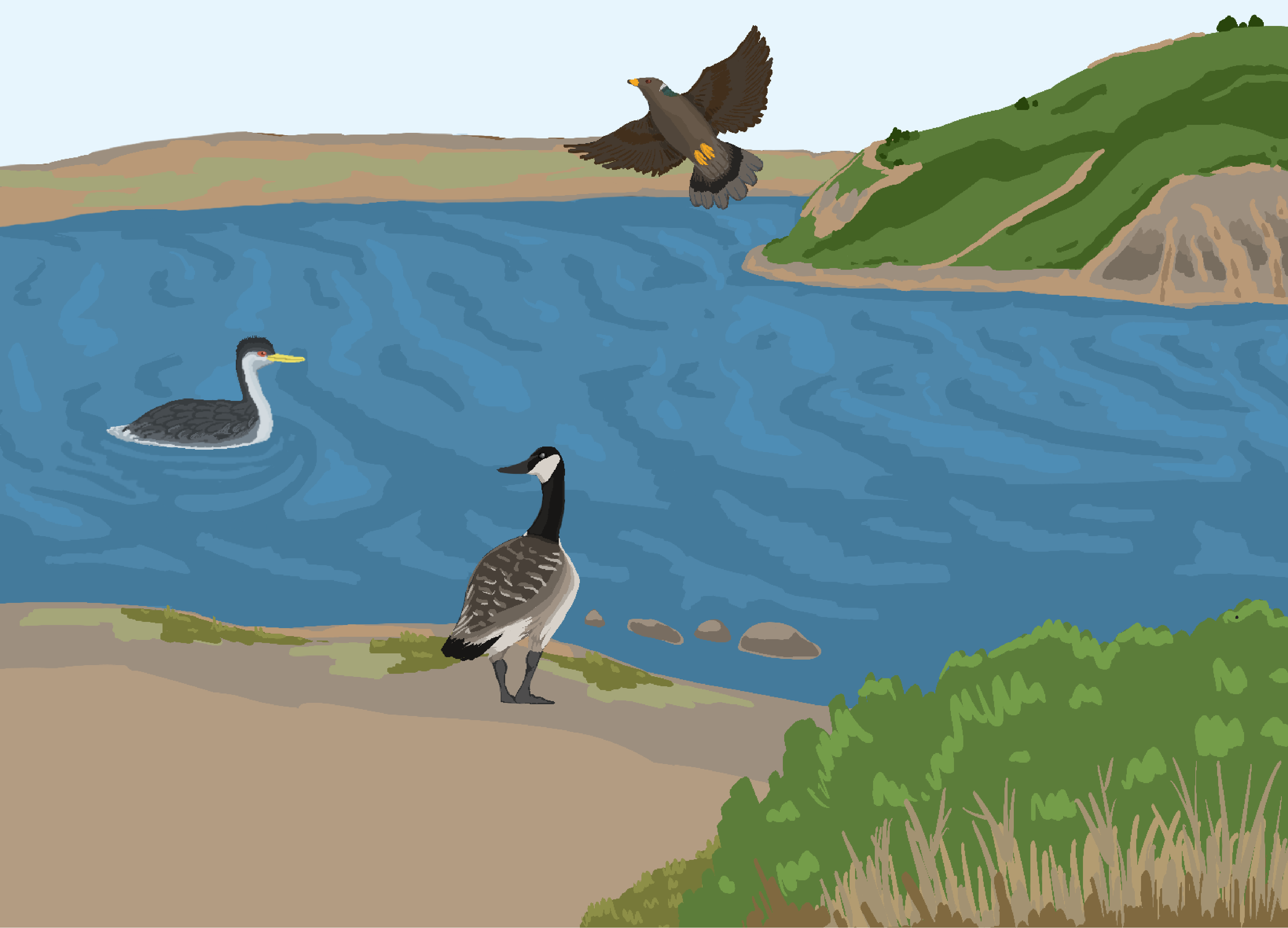
Here’s why the Bay Area is so important for birds — and where to find them
What I did: I spearheaded the design and visual layout of this story, conducted data analysis and visualization of bird migratory pathways and provided scientific encyclopedia-style illustrations in collaboration with data reporter Christian Leonard.
From as far as Alaska, massive flocks of birds leave their breeding grounds as fall weather portends the arrival of frigid temperatures and the loss of their best food sources. The journey south is a long one — thousands of miles for many species. Some will travel all the way to South America, where the warmer weather means food is plentiful.
But there are havens along the way, rich habitats still lush with fish and insects to fuel their trek along the Pacific Coast. And for many species of birds, few havens in California are more important than the San Francisco Bay Area.
🏆 Police are using secret deals to hand pensions to troubled officers. Millions of taxpayer dollars support the system
🏆 This investigative story has won the 2025 Selden Ring Award, the 2024 George Polk Award for Justice Reporting, the Goldsmith Prize for Investigative Reporting, a 2024 IRE Award and an E.W. Scripps Howard “Excellence in Local/Regional Investigative Reporting” Award. What I did: I spearheaded the design and development of interactive tools and graphics for this multi-year, multi-part investigative series into corruption among California law enforcement officers. The interactive tool (treemap) in the second part allows readers to learn which law enforcement offices by county gave the most amount of money in illegal disability pensions to officers who signed clean records agreements.
Some California police officers who get into trouble suddenly claim they’ve been injured. Their departments disagree, but still erase their misconduct and award them lifetime disability pensions. Under California law, police agencies are forbidden from dangling disability pensions as an inducement to rid themselves of problem officers. But an investigation by the San Francisco Chronicle and UC Berkeley’s Investigative Reporting Program identified 49 officers across the state who, on the verge of being ousted for alleged misconduct, were allowed to walk away with their wrongdoing hidden and collect lifetime disability pensions for injuries their own employers had challenged as unsubstantiated.
🏆 This is the secret system that covers up police misconduct — and ensures problem officers can get hired again
🏆 This investigative story has won the 2025 Selden Ring Award, the 2024 George Polk Award for Justice Reporting, the Goldsmith Prize for Investigative Reporting, a 2024 IRE award and an E.W. Scripps Howard ’Excellence in Local/Regional Investigative Reporting’ Award. What I did: I spearheaded the design and development of interactive tools and graphics for this multi-year, multi-part investigative series into corruption among California law enforcement officers. The interactive tools (bubble maps) in this first part allows readers to search law enforcement offices by county and learn (1) how transparent local offices were and (2) how many officers at these local offices signed clean records agreements. For years, dozens of California police agencies have executed “clean-record agreements,” clandestine legal settlements that promise to hide the wrongdoing of an officer in exchange for the officer’s guarantee to leave an agency without a fight, an investigation by the San Francisco Chronicle and UC Berkeley’s Investigative Reporting Program.
Thousands of California owls likely to be shot in order to save native species
What I did: I developed an accompanying interactive graphic displaying a keyboard-accessible slide to better visually compare the differences between barred and Northern spotted owls, complete with zoomed-in annotations and audio components of each owl’s calls. The U.S. Fish and Wildlife Service has proposed to allow licensed professionals to kill, at most, 450,000 barred owls over 30 years in California, Oregon and Washington to protect not just the northern spotted owl but also the forest ecosystems where the threatened bird evolved.
🏆 S.F.’s iconic Powell Street is lined with empty storefronts. Can it be saved?
What I did: I helped spearhead the design of this project, including the fade-in postcard topper and horizontal scrolly timeline transitions comparing store openings and closings.
Two of the three massive storefronts in the historic Flood Building — owned by Flood’s family for two generations — sit empty. The building is one of the first sights visitors or residents encounter when exiting the BART station or waiting for the cable cars. When tourists hop on cable cars, the most prominent sights are colorful “for lease” ads plastered on every window from the turnaround to Union Square, instead of the chock-a-block boutiques and shops that used to line the street.
The hollowed-out three-block stretch was once home to popular shops like Uniqlo, H&M, Rasputin Records and Lush, eateries like Blondie’s Pizza and Tad’s Steaks, and mom-and-pop stores like Marquard’s Smoke Shop. They’re all gone now.
S.F. feces complaints rise again despite city spending millions on public toilets
What I did: I designed and developed a map showing all publicly accessible restrooms throughout the city as of March 2024 to accompany a piece on feces complaints steadily rising even with city-run public restroom programs. Readers can filter by “type” of restroom (for instance, whether the restroom is within a BART train station) and filter ones that are wheelchair accessible, open 24 hours or staffed. They can also click on each point to see locations and hours and days that the restrooms are open. I also compiled data from multiple sources, confirmed and revised information, including locations, availability and accessibility, with multiple public and private sources, developed the map and did background reporting.
What I did: I spearheaded the full project design, illustrated for each section and contributed written reporting to a section of this guide.
In this guide, the Chronicle’s Korean American staffers share their favorite comfort foods — galbitang (갈비탕), soondaeguk (순대국), kimbap (김밥), tteokmanduguk (떡만두국) — and where to get them in the Bay Area. Each of us come from similar but different backgrounds, hometowns and connections to the land of our heritage. And we each have our own takes on the food that nurtures our souls. I contributed to a section of this guide, and illustrated and designed the whole project.
Millions of trees have died in California forests. This map shows the hardest-hit areas
In 2022, not counting wildfire deaths, over 36 million trees in California’s national forests died.
What I did: I spearheaded the design, development and reporting for this project. I developed a scrolly map walking through California forests affected most by tree death, and reported on the main causes of tree death: drought stress, flooding, insect population increases and disease.
S.F. must create 82,000 new homes in 8 years. The city is already behind
What I did: I spearheaded the full-page design of this multimedia project. I built a scrolly video explaining the city’s ambitious housing plan, collaborating with fellow designer Daymond Gascon, and created Datawrapper visualizations to visually convey how daunting and impossible the housing plan is.
San Francisco has a mind-boggling challenge ahead: Approve 82,000 new homes by 2031. The mandate comes from California officials, who say they’re committed to improving the state’s crippling housing shortage. But can it be done?
This one fact will completely change how you think about California wildfires
What I did: I spearheaded the full project design for this multimedia story, developing a scrolly timeline on fire suppression in the U.S. West and implementing a responsive illustrative infographic showing how fire suppression changed California forests.
In recent years, California’s wildfires have seemed ever more apocalyptic. Huge swaths of forest have been wiped out, forcing thousands to flee and choking many more with smoke. But here’s a fact that may seem surprising: Even more of the California landscape used to be on fire. Before the 1800s, when Europeans flooding into California outlawed fires set by Native Americans, at least 4.5 million acres — and sometimes up to 12 million acres — burned in California every year, according to UC Berkeley researchers.
That figure has only one modern equivalent: 2020. That year, California wildfires burned over 4.3 million acres — more than double the state’s previous record.
As Restrictions Go Away, Long COVID Is Here To Stay
Programs/Tools used: Adobe Premiere Pro, Audacity, Zoom H1n Handy Microphone, Blue Yeti USB Microphone
Even as restrictions go away, long COVID is here to stay.
After over a year of lockdown, Governor Gavin Newsom lifted COVID-19 restrictions on June 15. With proof of vaccination, California residents are now allowed to engage in pre-pandemic activities such as indoor dining and concert-going without masks or social distancing.
For thousands of long haulers, however, the pandemic is far from over. Featuring experts such as Lisa McCorkell, one of the founding members of Patient-Led Research Collaborative; Dr. Bradley Sanville, a pulmonologist working at the Post COVID-19 Clinic at UC Davis; and Laura Stock, Director of the Labor Occupational Health Program at the University of California, Berkeley, this episode delves into what exactly long COVID, or Post-Acute Sequelae of SARS-CoV-2, entails and what research is being done and what this implies for the future of work and wellbeing.
Stanford stunner: Tara VanDerveer announces her retirement
After 38 years at Stanford University and compiling the most wins in college basketball history, Tara VanDerveer announced Tuesday night she would retire as the head coach of the Cardinal’s women’s team. VanDerveer, 70, spent 45 years as a head coach at Idaho (1978-80), Ohio State (1980-85) and Stanford (1985-95, 1996-2024), amassing an NCAA-record 1,216 victories. At Stanford, she led the team to three NCAA championships (1990, 1992 and 2021) and 14 Final Fours.
She had multiple abortions as a child. Her abuser didn’t expect what came later
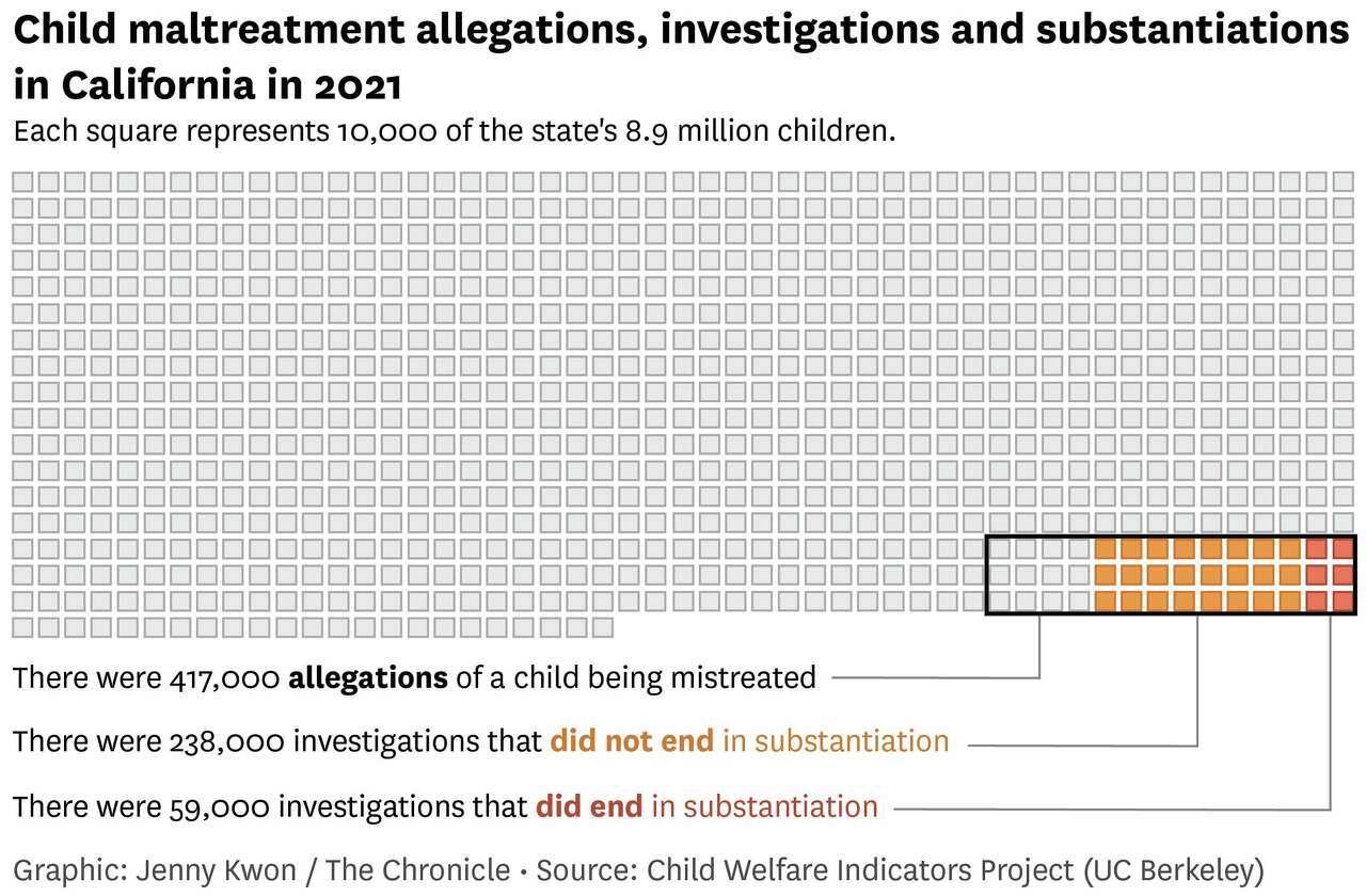
What I did: I created a static graphic comparing total, substantiated and non-substantiated child maltreatment allegations to the total number of children in California as part of a story of a survivor who received multiple abortions as a child.
Billions of people still lack high-speed internet. This S.F. company is building satellites to change that.
What I did: I created from scratch vector illustrations showing the differences between LEO (Low Earth Orbit) and GEO (Geostationary Earth Orbit) orbit satellites. As it turns out, beaming high-speed internet to the remote corners of Alaska from thousands of miles away in space starts with a brick of titanium in a San Francisco warehouse. In a vast complex where the U.S. once churned out World War II-era Liberty ships, Astranis is building satellites that it plans to send to orbit more than 22,000 miles above the Earth’s surface, with the first slated to be borne skyward aboard a SpaceX Falcon Heavy rocket from Cape Canaveral next year.
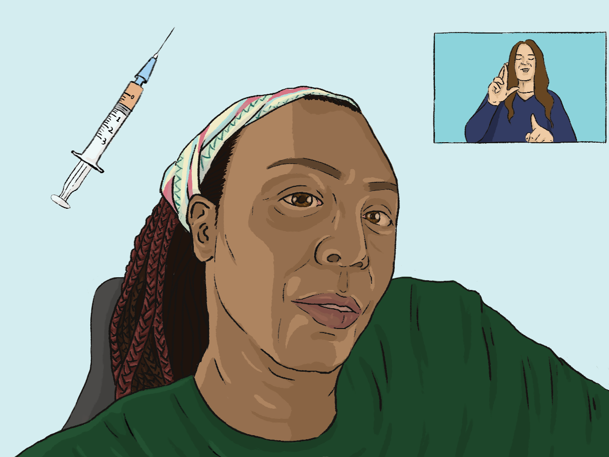
High-Risk CA Residents May Be Eligible for COVID-19 Vaccine
What I did: I reported on and illustrated the topper image for this piece on the California vaccine rollout and impact on disabled Californian residents. On February 11, 2021, the California Department of Public Health (CDPH) updated their guidelines on allocating COVID-19 vaccines to include high-risk individuals. This revision in the vaccine rollout plan stem from immense pushback from disabled citizens and advocates after Governor Gavin Newsom announced on January 25 that California would be switching from a plan that prioritized both healthcare workers and “people at increased risk for severe illness or death from COVID-19” in Phase 1 to an age-based vaccination eligibility framework. The collective response from disabled communities and leaders was swift.
One month after Supreme Court’s Roe ruling, over half of states have banned or moved to limit abortions
In the King County area, E&Ts turned away about half of all referrals over the past two years due to medical reasons. Examples include dementia, CPAP machines, substance use, autism or a developmental disability, pregnancy, or a person with COVID-19.
How schools in Seattle are being affected by dwindling enrollment
Languages/Programs used: jQuery/Javascript (to create a responsive, filterable table)
Seattle lost 3,238 students from the 2019-20 to 2021-22 school year. And in the fall SPS projects it will lose 812 more, dropping its total enrollment to 48,748 students. Public school enrollment has fallen throughout the state since the pandemic began, but it’s not clear why Seattle numbers are so dismal.
Costco’s $1.50 hot dog deal has defied inflation. Fans say it isn’t what it used to be.
Languages/Programs used: Google Sheets (data analysis), Adobe Illustrator (static graphic)
Fans of Costco’s hot dog combo can rest assured that the price won’t increase anytime soon, as CEO Craig Jelinek told CNBC on Monday. As food costs skyrocket and inflation hits record highs, even for wholesalers, Costco will hold steady on its iconic dog-and-drink deal. The combo has cost $1.50 since it first arrived in food courts in 1985, even though the Bureau of Labor Statistics’ inflation calculator says it’s worth more than $4 today.
Once enslaved, this man helped build Tacoma; his great-granddaughter wants you to know him
John N. Conna fought his way out of enslavement to achieve political and business success in Washington state. His great-granddaughter wants you to know him.
Removing Lower Snake River dams offers best chance for salmon recovery — at steep price, report says
If four Lower Snake River dams were breached to support salmon recovery, the energy, irrigation, recreation and other benefits they provide to the Pacific Northwest could be replaced for $10.3 billion to $27.2 billion, according to a draft report released Thursday by U.S. Sen. Patty Murray, D-Wash., and Washington Gov.
California Failed to Consistently Track Ride-Hailing Assault and Harassment Complaints
Languages/Programs used: Google Sheets (data analysis), Datawrapper (visualization)
The agency responsible for regulating the ride-hailing industry in California has failed to collect consistent data on claims of assaults, threats and harassment on Uber and Lyft rides, a San Francisco Public Press investigation found.
Rent Payments to SF Public Housing Agency Plunged in Last Two Years, Spurring Eviction Fears
What I did: I conducted data analysis, created the data visualization and contributed reporting to this piece. Rent collections by San Francisco’s public housing agency fell precipitously in late 2019 and have continued to decline to less than half of what is owed, according to a San Francisco Public Press analysis — but the agency can’t explain why.
Languages/Programs used: Google Sheets (data analysis), Adobe Illustrator (vizualization)
The morning and evening commute nearly disappeared in March 2020 as the Bay Area went into pandemic lockdown, and while travel on public transit continues to lag this summer, many people are getting behind the wheel to get to and from their jobs.
Queer, Here, and Mistreated: LGBTQIA+ Disparities in Healthcare
I reported this piece and illustrated the topper image.
The fight for LGBTQIA+ acceptance has made major strides in recent years. The goal of health equity, however, has yet to be achieved, especially for many LGBTQIA+ identifying individuals living outside of UC Berkeley, other universities and even the United States.
The Cultural Whiplash of a Second-Generation Korean American
A piece to unpack my childhood and, with it, my bitterness: the after-effect of the cultural whiplash. We were forced to blend in and acculturate with culturally-white Americans in the late 90s and 00s, only to suddenly be fetishized in the 2010s because we happened to come from the same background as people’s now-favorite idols.
Eyayu Genet’s "Sugypia:" Water Activism and Uniting Sudan, Egypt and Ethiopia Through Art
(Bahir Dar, Ethiopia) “Sugypia,” an amalgamation of Sudan, Egypt and Ethiopia, three neighboring countries served by the Nile, is one of many colorful pieces created by Eyayu, a prominent Ethiopian artist-activist born and raised on the banks of Lake Tana, Ethiopia’s largest lake and the source of the Blue Nile. An artist of national consciousness, Eyayu incorporates both the symbolism from these bodies of water and indigenous aesthetics into his paintings and collages. His art is characterized by contrasting themes like traditionality versus modernity and the organic versus the artificial, aiming to raise awareness of the culture of Lake Tana and the Blue Nile’s lakeside communities and the environmental issues they face.
Alternative Medicine: A Good Alternative to the Doctor?
In the modern age of healthcare, even when new technology is being developed every day to cure and rid previously untreatable illnesses, populations around the world still utilize alternative and complementary medicine. What exactly is alternative medicine? What practices are there? Who practices CAM, and what are the consequences? Why should we care about alternative and complementary medicine?
[Contributed] Violence Against Health Care: Attacks During a Pandemic
I contributed to fact-checking incidents of violence against healthcare workers in México that were cited in this overall report created in collaboration between the Human Rights Center at UC Berkeley and Insecurity Insight. AP News also reported on this phenomenon based on this report.
Skills/Programs used: TweetDeck (open-source data collection on social media), fact-checking
Linguistic Diversity & Accessibility of Mental Health Services in Ventura County in relation to the Woolsey Fire
During the spring semester of 2020, I attempted to assess whether the Hill-Woolsey Fire specifically had an impact on Ventura County - a county that had endured multiple trauma-inducing events in a short period of time - from a linguistic lens by mapping all Medi-Cal (California’s version of Medicaid) accepting mental health facilities listed by the Ventura County Behavioral Health Department from 2017, 2018 and 2020 and by analyzing Ventura County’s needs assessment and long-term disaster recovery plan and identifying linguistic gaps.
On March 27, 2020, the Coronavirus Aid, Relief, and Economic Security (CARES Act) was signed into law. Click on the link above to view an interactive bubble map visualizing the different amounts allocated to higher education institutions across California and read a little bit more about how these allocations were calculated.
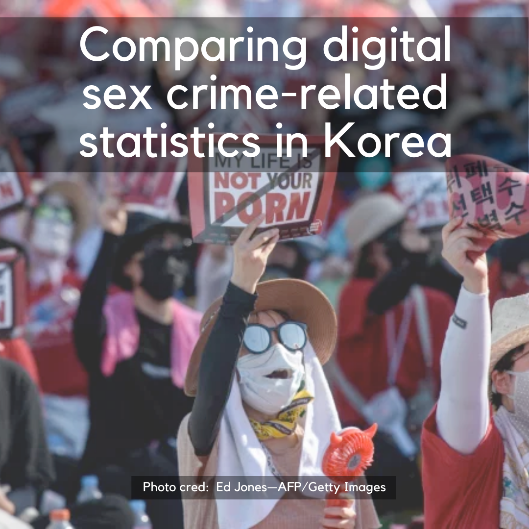
몰카. Molka. It’s an abbreviation for “mollae cameras (몰래 카메라),” otherwise known as “secret" or "hidden cameras," and describes the act of secretly filming mainly female-identifying victims in public and private areas such as bathrooms or love motels and releasing this illegal footage on the internet. Unfortunately, this phenomenon is not a newly reported issue in Korea. Click on the link to read more, see where I got the data from and view charts on related crime statistics.
Languages/Programs used: Google Sheets (data scraping & cleaning), Tableau (visualization)
I wanted to see if there was a way I could scrape the Library of Congress’s “Chronicling America” database and visualize the distribution of recorded newspapers still operating today (labeled as “current” in the database) in California by county and by city/neighborhood. I wanted to see if there were certain geographic areas within California where there was a dearth of local daily or monthly news, online or in print. The data was cleaned using Google Sheets. Click on the link above to view and interact!
Languages/Programs used: Google Sheets (data scraping & cleaning), Tableau (visualization)
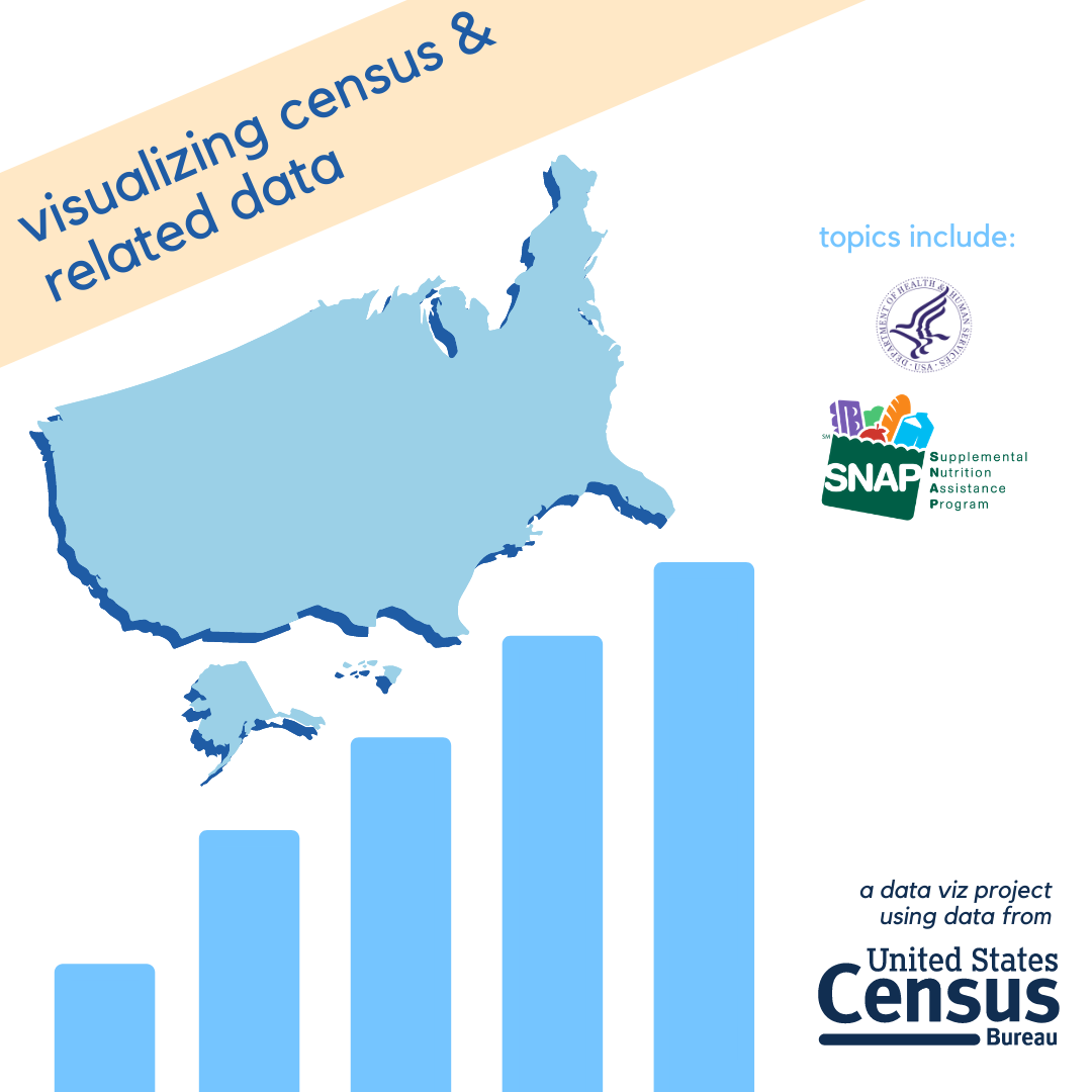
These census-related visualizations were created as an independently-led project I did during the 2019 UC Berkeley Data Discovery Summer Program. That summer, the research cohort focused on developing ways to raise awareness about the importance of the decennial U.S. Census. I decided to create Tableau visualizations using the most recent census and census-related data at the time that showed users how they could look up different statistics related to SNAP - the Supplemental Nutrition Assistance Program - and health insurance coverage as a way to gauge how the counties or states they lived in compared to the rest of the U.S. Click on the link above to view, interact and read more.
Investigating the history of EDM (and its roots in European techno) and how big pioneers of the genre were Black queer artists or queer artists of color, I wondered how rich and diverse my own EDM listening taste was. Was I listening to a variety of artists from different backgrounds? Were the songs I had on repeat or the most songs I had on my EDM playlist from people of color (poc) or women/gender-nonconforming/nonbinary folks? Click the link above to follow a step-by-step tutorial on how I analyzed my own EDM playlist (and how you can too).
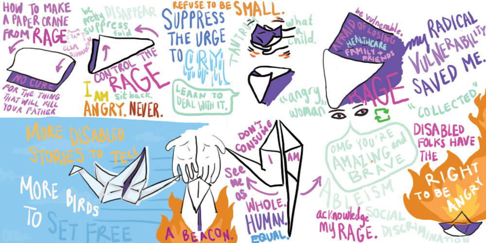
Disability Visibility was revolutionary in putting disabled voices and dreams into modern mainstream media. I illustrated my interpretation of six stories that touched me and impacted my view of what constitutes disability justice and what is needed to create a kinder and more accessible world. These stories include: "Six Ways of Looking at Crip Time" by Ellen Samuels, "The Beauty of Spaces Created for and by Disabled People" by s.e. smith, "How to Make a Paper Crane from Rage" by Elsa Sjunneson, "Nurturing Black Disabled Joy" by Keah Brown, "I am too pretty for Ugly Laws" (a poem by Lateef McLeod embedded in the story "Gaining Power through Communication Access"), and "I’m Tired of Chasing a Cure" by Liz Moore. Click the link above to view these illustrations in a keyboard accessible carousel/gallery and read more on my interpretations of them.
Slightly different rendition of Flume’s Skin album
Portrait of my good friend
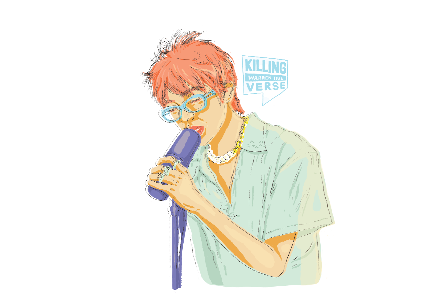
Portrait of someone whom I wish were my friend: Warren Hue from 88Rising
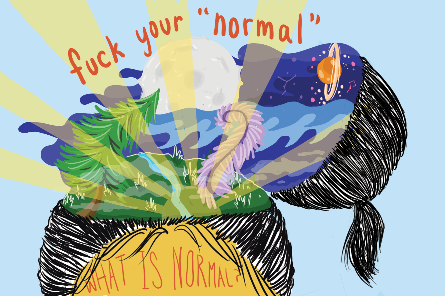
A portrait of a head splitting open to reveal a landscape with a shining sun, grass, waves and space. The phrase "fuck your ’normal’" hangs above the split-open head.
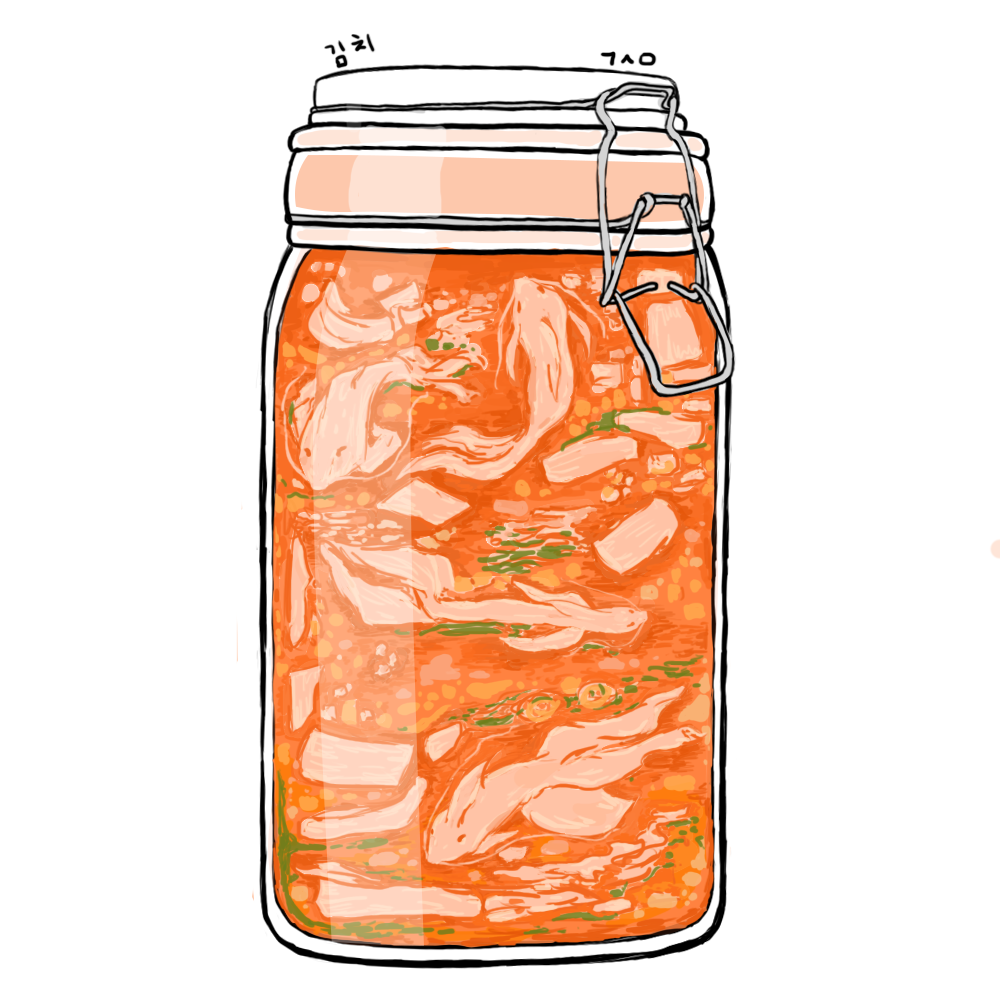
One of my sticker ideas: A jar of kimchi, but the kimchi is shaped like koi fish swimming in brine.
 What I did: I led both back-end development to pull wastewater data daily at 9 AM PST from WastewaterSCAN API and front-end development to display SARS-CoV-2 historic and most recent concentration levels at different Bay Area wastewater treatment plants. I also included long COVID resources and a map of sewershed boundaries for Bay Area readers to identify which sewershed serves them.
 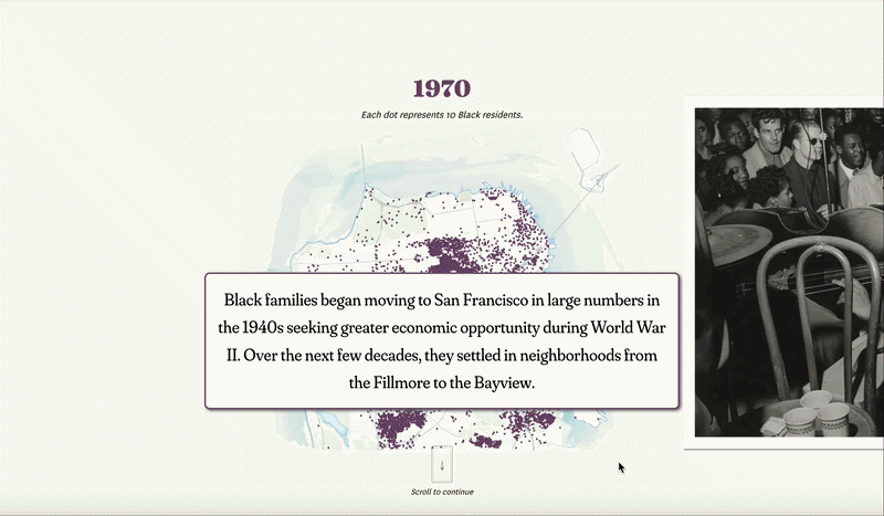 What I did: I designed and developed primarily the topper of this story highlighting the different hubs of Black culture and community in San Francisco in the last several decades.
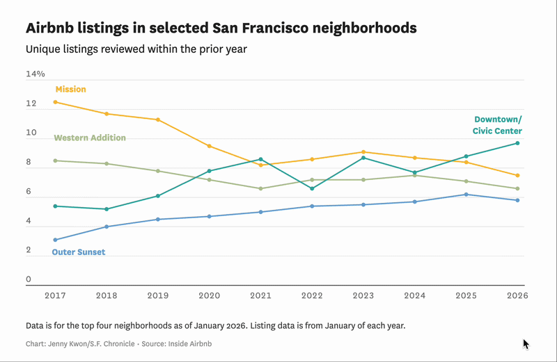 What I did: I conducted the data collection, analysis, reporting and visualization for this story revisiting the Airbnb landscape in San Francisco. Looking at Inside Airbnb data, I described trends in neighborhoods with the largest shares of Airbnb listings, a continued gap between total and active listings and the largely policy-driven change from hosts managing short-term listings to more intermediate and long-term listings.
  For 100 years, this family fought to free the Klamath River. As a child, Amy Bowers Cordalis learned a legend from her Yurok ancestors. If the Klamath River salmon die, so will the Yurok people.
  🏆 This investigative story was a 2026 Pulitzer Prize finalist in the Investigative Reporting category.
 🏆 This story received an Award of Excellence at
  What I did: I spearheaded the design and visual layout of this story, conducted data analysis and visualization of bird migratory pathways and provided scientific encyclopedia-style illustrations in collaboration with data reporter Christian Leonard.
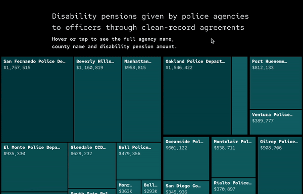 🏆 This investigative story has won the
 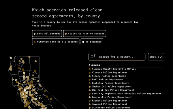 🏆 This investigative story has won the
 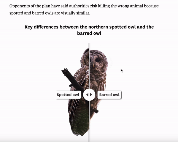 What I did: I developed an accompanying interactive graphic displaying a keyboard-accessible slide to better visually compare the differences between barred and Northern spotted owls, complete with zoomed-in annotations and audio components of each owl’s calls.
 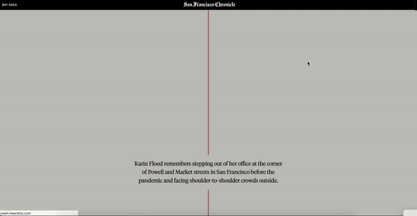 🏆 This story received an Award of Excellence at
 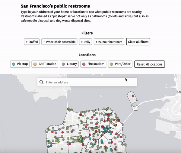 What I did: I designed and developed a map showing all publicly accessible restrooms throughout the city as of March 2024 to accompany a piece on feces complaints steadily rising even with city-run public restroom programs. Readers can filter by “type” of restroom (for instance, whether the restroom is within a BART train station) and filter ones that are wheelchair accessible, open 24 hours or staffed. They can also click on each point to see locations and hours and days that the restrooms are open. I also compiled data from multiple sources, confirmed and revised information, including locations, availability and accessibility, with multiple public and private sources, developed the map and did background reporting.
  What I did: I spearheaded the full project design, illustrated for each section and contributed written reporting to a section of this guide.
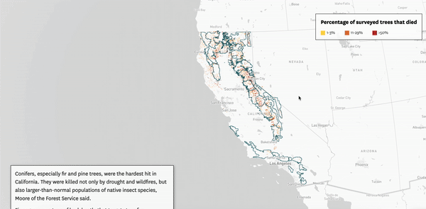 In 2022, not counting wildfire deaths, over 36 million trees in California’s national forests died.
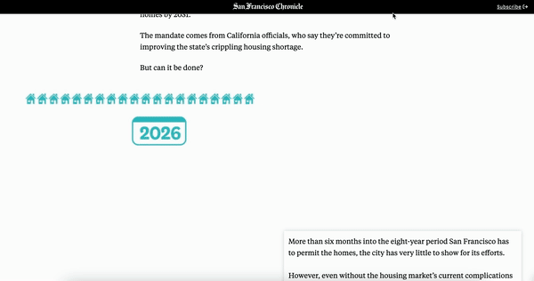 What I did: I spearheaded the full-page design of this multimedia project. I built a scrolly video explaining the city’s ambitious housing plan, collaborating with fellow designer Daymond Gascon, and created Datawrapper visualizations to visually convey how daunting and impossible the housing plan is.
 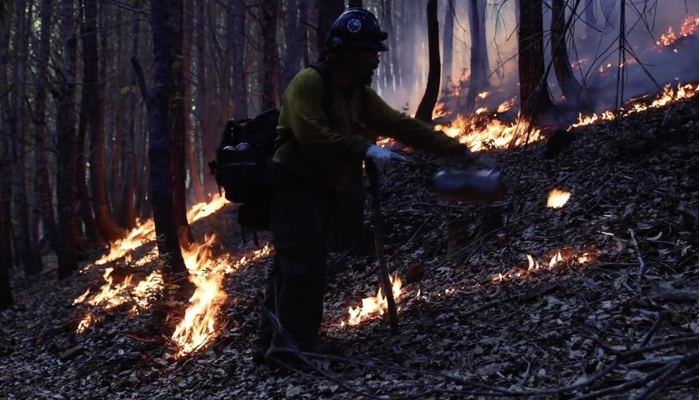 What I did: I spearheaded the full project design for this multimedia story, developing a scrolly timeline on fire suppression in the U.S. West and implementing a responsive illustrative infographic showing how fire suppression changed California forests.
  Even as restrictions go away, long COVID is here to stay.
 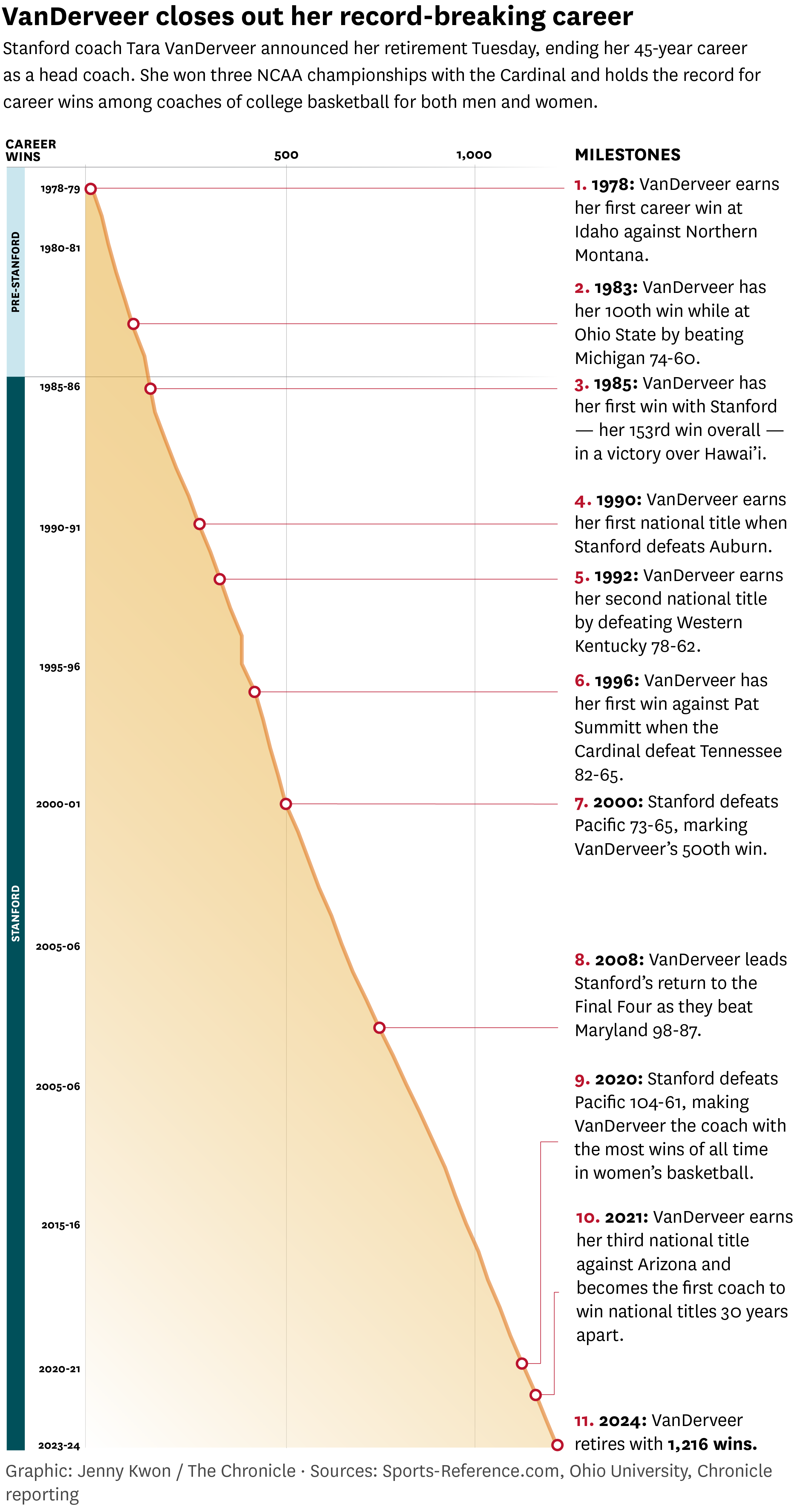 After 38 years at Stanford University and compiling the most wins in college basketball history, Tara VanDerveer announced Tuesday night she would retire as the head coach of the Cardinal’s women’s team. VanDerveer, 70, spent 45 years as a head coach at Idaho (1978-80), Ohio State (1980-85) and Stanford (1985-95, 1996-2024), amassing an NCAA-record 1,216 victories. At Stanford, she led the team to three NCAA championships (1990, 1992 and 2021) and 14 Final Fours.
 What I did: I created a static graphic comparing total, substantiated and non-substantiated child maltreatment allegations to the total number of children in California as part of a story of a survivor who received multiple abortions as a child.
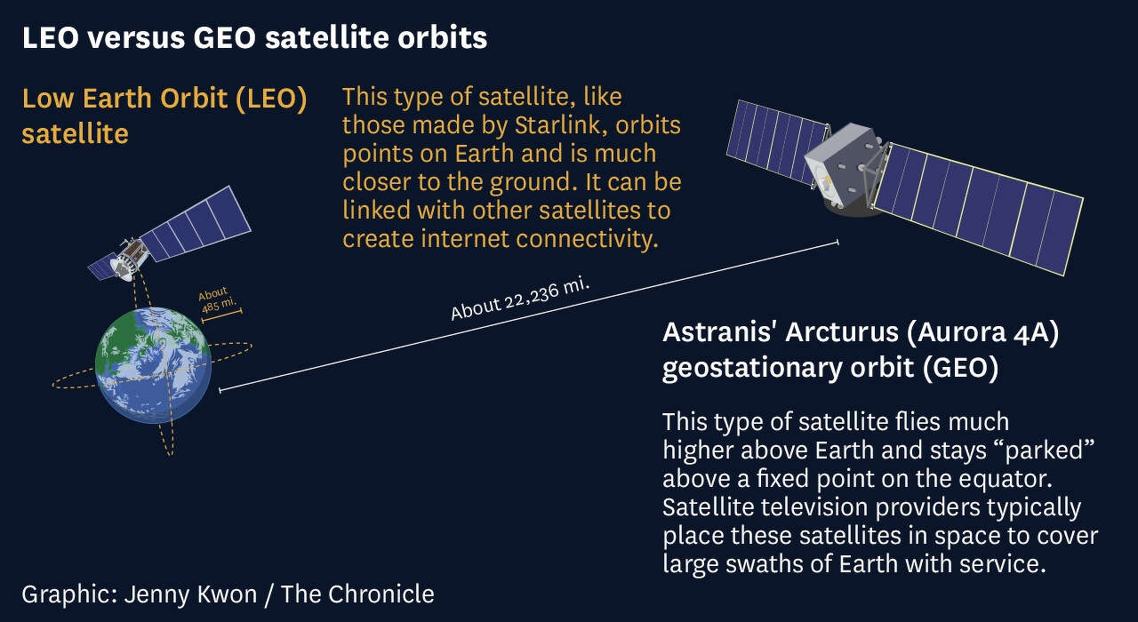 What I did: I created from scratch vector illustrations showing the differences between LEO (Low Earth Orbit) and GEO (Geostationary Earth Orbit) orbit satellites.
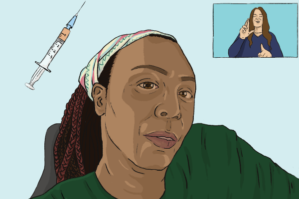 What I did: I reported on and illustrated the topper image for this piece on the California vaccine rollout and impact on disabled Californian residents.
 One month after Supreme Court’s Roe ruling, over half of states have banned or moved to limit abortions.
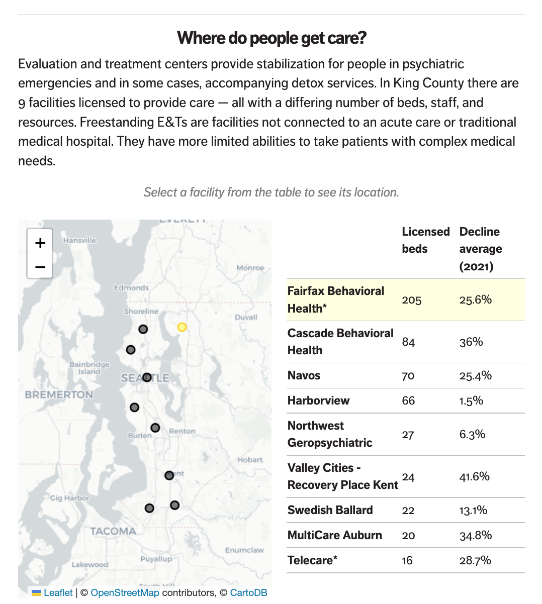 In the King County area, E&Ts turned away about half of all referrals over the past two years due to medical reasons. Examples include dementia, CPAP machines, substance use, autism or a developmental disability, pregnancy, or a person with COVID-19.
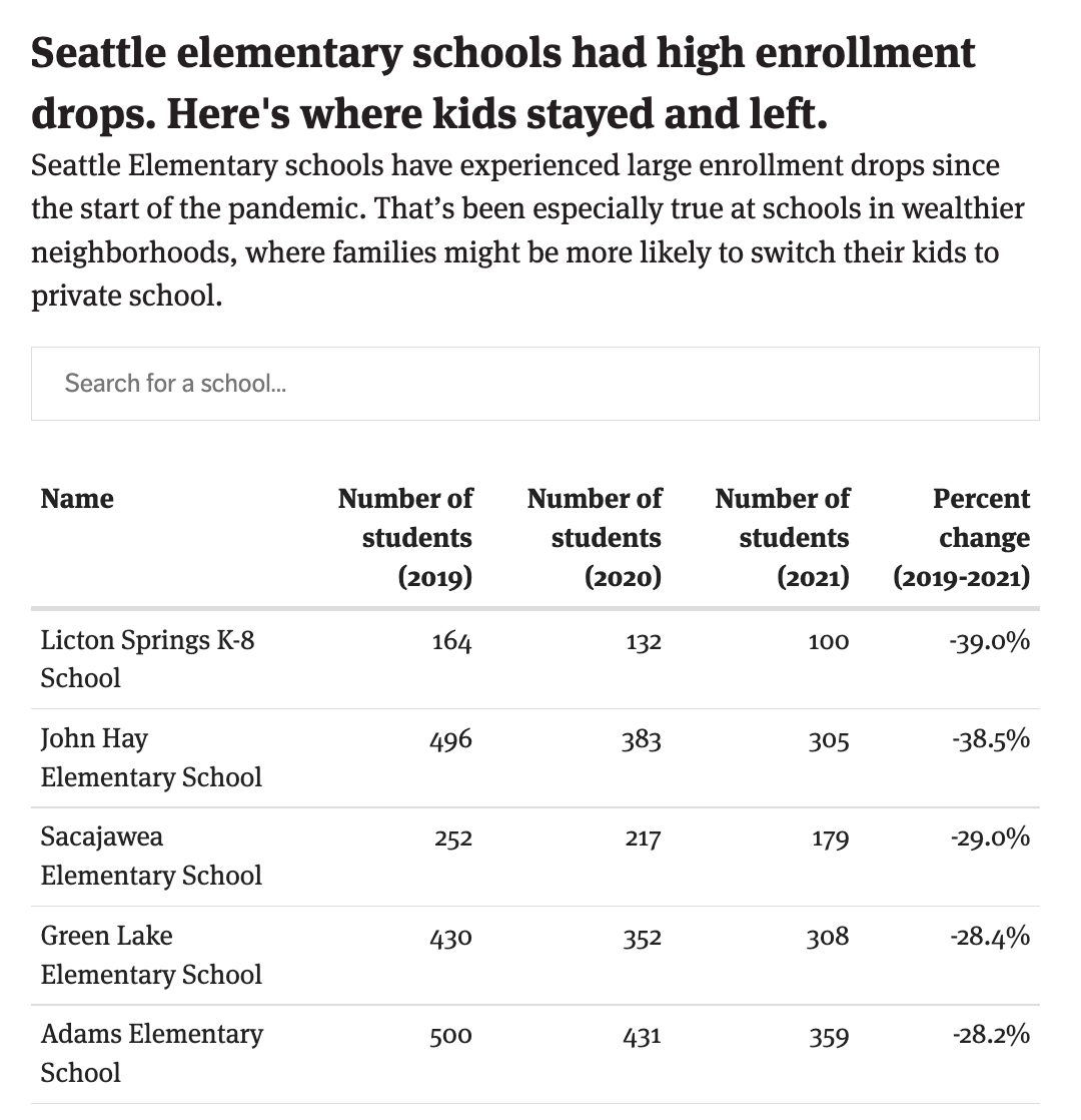 Seattle lost 3,238 students from the 2019-20 to 2021-22 school year. And in the fall SPS projects it will lose 812 more, dropping its total enrollment to 48,748 students. Public school enrollment has fallen throughout the state since the pandemic began, but it’s not clear why Seattle numbers are so dismal.
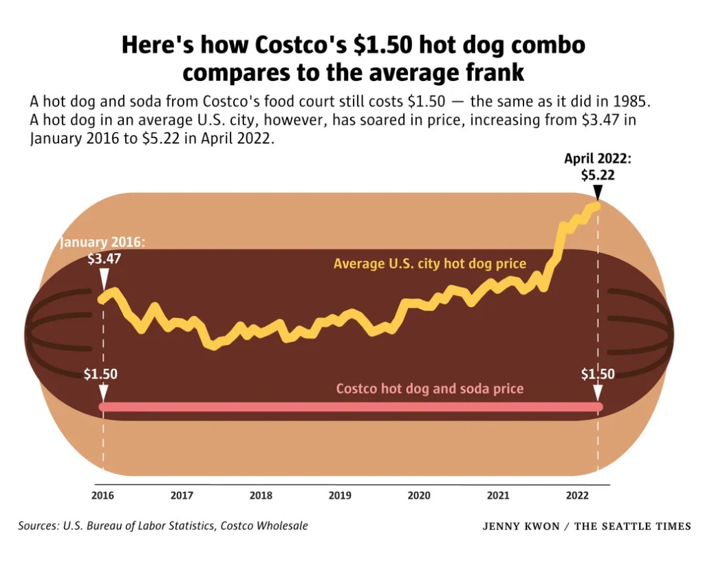 Fans of Costco’s hot dog combo can rest assured that the price won’t increase anytime soon, as CEO Craig Jelinek told CNBC on Monday. As food costs skyrocket and inflation hits record highs, even for wholesalers, Costco will hold steady on its iconic dog-and-drink deal. The combo has cost $1.50 since it first arrived in food courts in 1985, even though the Bureau of Labor Statistics’ inflation calculator says it’s worth more than $4 today.
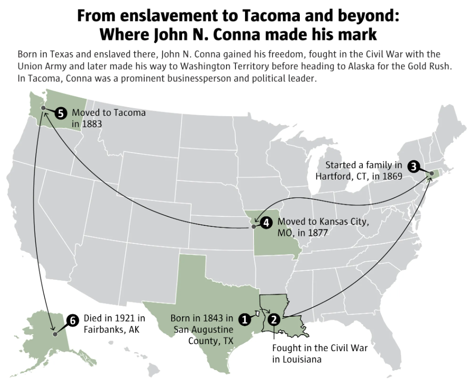 John N. Conna fought his way out of enslavement to achieve political and business success in Washington state. His great-granddaughter wants you to know him.
 If four Lower Snake River dams were breached to support salmon recovery, the energy, irrigation, recreation and other benefits they provide to the Pacific Northwest could be replaced for $10.3 billion to $27.2 billion, according to a draft report released Thursday by U.S. Sen. Patty Murray, D-Wash., and Washington Gov.
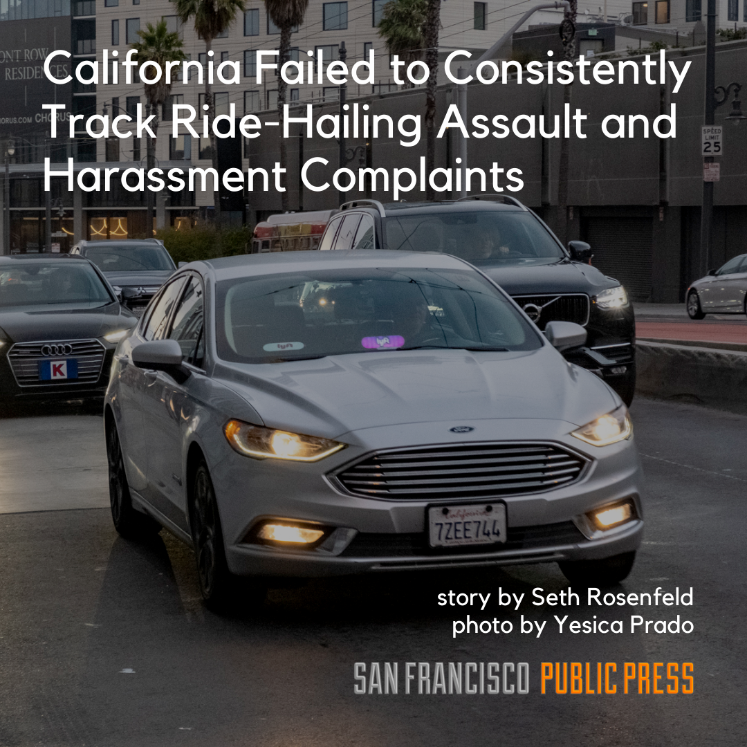 The agency responsible for regulating the ride-hailing industry in California has failed to collect consistent data on claims of assaults, threats and harassment on Uber and Lyft rides, a San Francisco Public Press investigation found.
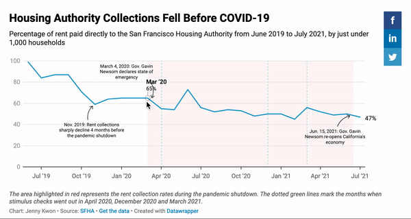 What I did: I conducted data analysis, created the data visualization and contributed reporting to this piece.
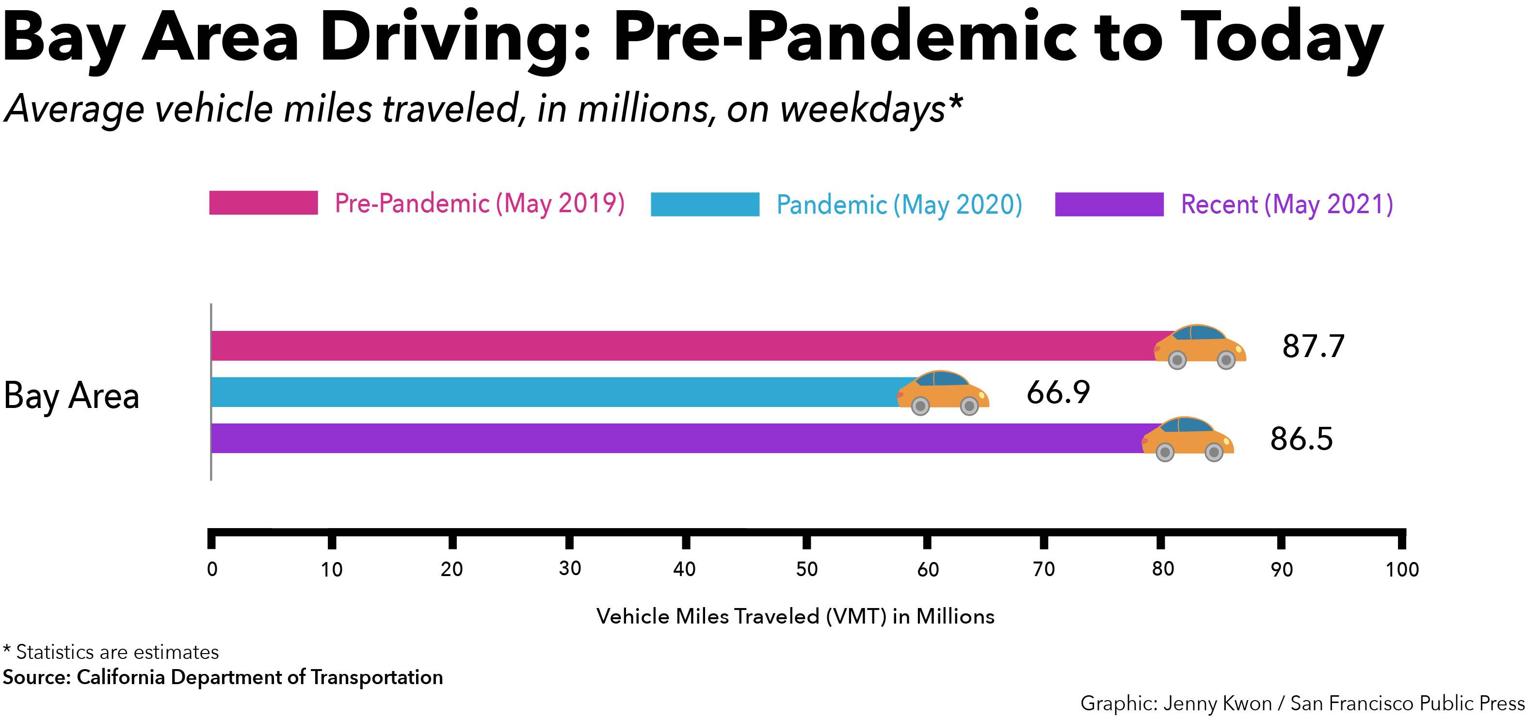 The morning and evening commute nearly disappeared in March 2020 as the Bay Area went into pandemic lockdown, and while travel on public transit continues to lag this summer, many people are getting behind the wheel to get to and from their jobs.
 I reported this piece and illustrated the topper image.
 A piece to unpack my childhood and, with it, my bitterness: the after-effect of the cultural whiplash. We were forced to blend in and acculturate with culturally-white Americans in the late 90s and 00s, only to suddenly be fetishized in the 2010s because we happened to come from the same background as people’s now-favorite idols.
  (Bahir Dar, Ethiopia) “Sugypia,” an amalgamation of Sudan, Egypt and Ethiopia, three neighboring countries served by the Nile, is one of many colorful pieces created by Eyayu, a prominent Ethiopian artist-activist born and raised on the banks of Lake Tana, Ethiopia’s largest lake and the source of the Blue Nile. An artist of national consciousness, Eyayu incorporates both the symbolism from these bodies of water and indigenous aesthetics into his paintings and collages. His art is characterized by contrasting themes like traditionality versus modernity and the organic versus the artificial, aiming to raise awareness of the culture of Lake Tana and the Blue Nile’s lakeside communities and the environmental issues they face.
  In the modern age of healthcare, even when new technology is being developed every day to cure and rid previously untreatable illnesses, populations around the world still utilize alternative and complementary medicine. What exactly is alternative medicine? What practices are there? Who practices CAM, and what are the consequences? Why should we care about alternative and complementary medicine?
 I contributed to fact-checking incidents of violence against healthcare workers in México that were cited in this overall report created in collaboration between the Human Rights Center at UC Berkeley and
  During the spring semester of 2020, I attempted to assess whether the Hill-Woolsey Fire specifically had an impact on Ventura County - a county that had endured multiple trauma-inducing events in a short period of time - from a linguistic lens by mapping all Medi-Cal (California’s version of Medicaid) accepting mental health facilities listed by the Ventura County Behavioral Health Department from 2017, 2018 and 2020 and by analyzing Ventura County’s needs assessment and long-term disaster recovery plan and identifying linguistic gaps.
 On March 27, 2020, the Coronavirus Aid, Relief, and Economic Security (CARES Act) was signed into law. Click on the link above to view an interactive bubble map visualizing the different amounts allocated to higher education institutions across California and read a little bit more about how these allocations were calculated.
 I wanted to see if there was a way I could scrape the Library of Congress’s “Chronicling America” database and visualize the distribution of recorded newspapers still operating today (labeled as “current” in the database) in California by county and by city/neighborhood. I wanted to see if there were certain geographic areas within California where there was a dearth of local daily or monthly news, online or in print. The data was cleaned using Google Sheets. Click on the link above to view and interact!
 These census-related visualizations were created as an independently-led project I did during the 2019
  Investigating the history of EDM (and its roots in European techno) and how big pioneers of the genre were Black queer artists or queer artists of color, I wondered how rich and diverse my own EDM listening taste was. Was I listening to a variety of artists from different backgrounds? Were the songs I had on repeat or the most songs I had on my EDM playlist from people of color (poc) or women/gender-nonconforming/nonbinary folks? Click the link above to follow a step-by-step tutorial on how I analyzed my own EDM playlist (and how you can too).
 Disability Visibility was revolutionary in putting disabled voices and dreams into modern mainstream media. I illustrated my interpretation of six stories that touched me and impacted my view of what constitutes disability justice and what is needed to create a kinder and more accessible world. These stories include: "Six Ways of Looking at Crip Time" by Ellen Samuels, "The Beauty of Spaces Created for and by Disabled People" by s.e. smith, "How to Make a Paper Crane from Rage" by Elsa Sjunneson, "Nurturing Black Disabled Joy" by Keah Brown, "I am too pretty for Ugly Laws" (a poem by Lateef McLeod embedded in the story "Gaining Power through Communication Access"), and "I’m Tired of Chasing a Cure" by Liz Moore. Click the link above to view these illustrations in a keyboard accessible carousel/gallery and read more on my interpretations of them.